One supporter said the logo looked like the work "of a three-year-old"
|
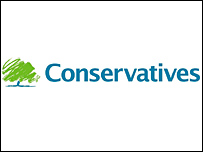
The Tories have unveiled a logo based around a "scribbled" drawing of a tree - although an ex-party chairman said it looked more like "a bunch of broccoli".
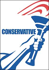
Designers were paid £40,000 to replace the traditional torch emblem with an image representing "strength, endurance, renewal and growth".
But Lord Tebbit made the comparison with the vegetable, saying that change was not necessarily "a good thing".
The logo was "patriotic", the editor of the Conservative Home website said.
"It's a strong image, and of course the green in it reinforces what David Cameron is trying to communicate in terms of a more environmentally-friendly party," Tim Montgomerie told BBC Radio 4's Today programme.
Lord Tebbit was not convinced, however.

Lady Thatcher introduced the previous torch logo in the 1980s
|
"I keep thinking of those tails on the British Airways aeroplanes a few years ago, when BA decided to reject its traditional British image," he said on the same programme.
"Trying to change, perpetually change - I don't think it's necessarily a good thing."
And one comment left on the website of prospective Tory candidate Iain Dale said it looked "like a three-year-old has been let loose with a crayon".
Contributors to the Conservative Home website variously said it was "really ugly" and like "the coin scratch on a lottery card".
One disappointed supporter even wrote: "I showed it to my daughter. She said, 'Did David Cameron give his baby a pen?'"
The party had planned to unveil the long-awaited design next week.
But it decided to bring the launch forward after images - taken from passes for next month's party conference in Bournemouth - appeared on websites.


~RS~q~RS~~RS~z~RS~13~RS~)