Monday, January 8, 2018

Should you paint landscapes from photos?

Laurent Guétal (French, 1841-1892) used a combination of photographs and plein-air studies to push his landscapes to a higher level.

Laurent Guétal, Lake Eychauda​​, oil,
182 × 262 cm (71.7 × 103.1 in)1886, Grenoble Museum
According to the Grenoble Museum, Guétal discovered a photograph of Lake Eychauda, ​​located in the French Alps. He went to the scene, at over 8200 feet in elevation, where he painted a plein-air study from the same point of view as the photo. Using the two sources of reference, he completed the painting in three weeks.

Laurent Guétal, The First Snow, oil, 1885
Other images by Guétal seem to be based on photos. Depending on your taste, the photographic influence either adds conviction and truth to the image or it makes it seem more mechanical.  


The plein air studies have all the verve and invention of anyone facing changing light with a paintbrush.

Laurent Guétal, The Bérarde en Oisans, 1882
The water in the foreground of this painting seems to match up with landscape painting conventions of the day, but I'm guessing he used photography to help with the far mountains.

To answer the rhetorical question in this post's title, I would say that photography can be a helpful supplement to—but not a substitute for—direct painting from nature. As Ivan Shiskin said:

"... Let me give you one major piece of advice, that underlies all of my painting secrets and techniques, and that advice is — photography. It is a mediator between the artist and nature and one of the most strict mentors you'll ever have. And if you understand the intelligent way of using it, you'll learn much faster and improve your weak points. You'll learn how to paint clouds, water, trees — everything. You'll better understand atmospheric effects and linear perspective and so on...----
Read the full post about Shishkin and Photography 
Other related posts: Zorn and Photography


Sunday, January 7, 2018

Ginkgo and Dragonfly Endpapers


Here's some more pen and ink art for the endpapers of “Dinotopia: Journey to Chandara.” The dragonfly, ginkgoes, and horsetail ferns are from the time of dinosaurs.
-----
Link to Speedball more samples of my pen art.
From Dinotopia: Journey to Chandara, which you can get signed from my website.

Saturday, January 6, 2018

Using Speedball's Dip Pens


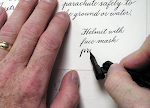
I use dip pens when I create illustrations and lettering because they deliver a look that evokes the style of the Golden Age of Ornamental Penmanship, which lasted from about 1850 to 1925.


Some of the most reliable dip pen nibs are the Hunt 102 and the Speedball C-series of nibs, which I'm using here for a map of Chandara. Some of these pens have a heritage that goes back in an unbroken line for more than 100 years.


The manufacturer, The Speedball Company still makes nibs, penholders, and many art products in their factory in North Carolina. (Link to video tour of their factory)


They just redid their website, creating Pro Pages that spotlight letterers, illustrators, and printmakers who use their products. When they realized that I've used their products since I was a teenager, they asked to feature my work, too.

No money changes hands, but it’s a nice way for a group of artists to appreciate a the work of a company and for a company to appreciate the work of artists.
------
Speedball Pro Pages: Drawing and Lettering
Lecture about the Golden Age of Ornamental Penmanship
The map appears on the inside of the dust jacket of the hardcover edition of Dinotopia: Journey to Chandara, which you can get signed from my website.
Speedball textbook for pen & brush lettering

Friday, January 5, 2018

How to make your own promo video

Joe Sutphin is an Ohio-based illustrator who produced his own behind-the-scenes video.


(Link to Video on YouTube) I think he did a beautiful job with it, so I asked him: Can you tell me how the video came to be and how you produced it? Did you do it by yourself? How did you learn video? I believe his story might inspire GurneyJourney readers who are thinking of creating their own behind-the scenes videos, book trailers, or how-to tutorials.

Joe says: "This past year has been tough at times, financially speaking. In 2017, I didn’t land a single new book illustration job. I finished writing a kids novel, did sample art for it, and my agent submitted it to at least 15 editors who each passed on it. I finished 2 illustrated kids novels that were landed in 2016, and turned in sketches for a picture book, but that has been slow due to several editors coming and going on the project. I actually just got the final manuscript last week, and that's a book I landed 2 summers ago, just to show you how slow-paced the picture book world can move at times. This drought has caused me to really consider what things I can be doing on my own to help work come my way."

"All that said, I started getting requests for speaking engagements, which I realized I really enjoy doing. It's very fulfilling to speak with kids and adults and encourage them in what they do. So I spent a good month putting together a nice visual Keynote presentation all about my childhood as a kid who was really only good at drawing pictures, and how that led to a career as an illustrator. I treated it with the same care I would any project, knowing that I was building a product. My good friend Brannon McAllister recommended that I make a short introduction video on my website to help promote me speaking at schools and libraries and whatnot. Really just a way to get educators and librarians to understand the gist of what my visit would entail. I was just thinking, a shot of my head talking to the camera: 'Hi, I'm Joe Sutphin, blah blah blah, let me come speak at your school or library.' With clips of my studio life spliced in here and there. Nothing too fancy."

"My wife Gina was hard at work, making Christmas gifts on her lathe down in her shop, so I just started filming little clips of the scenery in my studio upstairs by myself, using my Samsung Galaxy 7 phone’s Pro Settings, which allowed me to give it that yellowy, overcast haze."

"After I had shot about 30 or 40 little clips of studio space, I dumped them into Dropbox and pulled them into iMovie on my MacBook, which I've actually never used before. I spent many hours as a teenager making movies with my buddies, and always editing them in creative ways, so I had some general sense of what to try. I started editing clips together, and quickly realized that I didn’t want to talk to the camera and try to sell my school visits anymore. The images I was seeing felt more intimate and special than that, and I’m honestly not very natural at trying to sell things. I’m far better at telling a story than selling an idea."

"So I started writing a little monologue, and when I write articles for RabbitRoom.com I tend to start with an idea in mind and just try to tell my story with an arc. A start, which usually involves some form of tension. A turn, where there is either light at the end of the tunnel, or sometimes its where things might seem to get heavier. Then a conclusion, which can be a thoughtful statement or even a question to cause the reader to think beyond what they read, and might lead them to comment on the article. So my monologue just flowed with the basic themes of my presentation, from a kid not fitting in, to finding his place due to his talents. Then I used a little stand I found and strapped my phone to it and started shooting little action shots with me in them to fit with some of the things in my dialogue. And each time I added more shots, I would read the dialogue back and see what might need to change with the pacing of it, and what other shots I might like to insert. It was really organic. The videos were all shot over a 2 day span, but no outdoor light was present, so the time of day didn’t matter."

"After I had edited all the video together, I sat down and paced my final dialog to what was on film, practiced it a few times, and then recorded the audio track on my old digital Korg recorder downstairs and a condenser mic I have. The hardest part was just trying to read the dialogue without sounding like I was reading, while keeping my eye on the video to be sure my pacing was just right. I was able to cut and move audio once I inserted it in iMovie though."

"Then I asked my friend Michael, who leads the band at our church, if he would have time to record a little guitar thing I've heard him play before. It's a song he wrote about a guy in the 1930’s, falling in love and going off to war. The lyrics weren’t important, but the music was stuck in my head and I was certain it was the right thing for the film. I was floored, moved to tears, when Michael sent the audio track to me a few days later, and how perfectly it fit the structure of the film. Getting more music like that would be the hardest part of repeating such a film. It really all fell together so amazingly for not knowing what I was getting into."
-----
Visit Joe Sutphin's website

Light in Clouds feature in International Artist


The next issue of International Artist magazine (#119) features a six page article that I wrote about painting clouds.

It will soon be on newsstands, or you can subscribe at their website: International Artist magazine

Thursday, January 4, 2018

Semantic Mapping of Images

When we look at a scene, our visual systems naturally separate objects from each other and from the background.

Illustration by Robert Cunningham
Objects that are especially important, such as people, may appear more detailed and nuanced. When artists interpret the chaos of reality into a painting, they often apply this hierarchy to the finished image, resulting in what might be called a "style."

Here's another way to think about style: What artists really give us is reality seen through the filter of human perception.
Illustration by Bernie Fuchs
In the illustration above, for example, the elements are separated. Less important elements, such as the ground surface and the seats, are rendered in mostly flat color, but the faces and clothing patterns are rendered with more tones and details.

This ability to a) distinguish, b) identify, and c) prioritize elements within a scene is called "semantic mapping."

Until recently it has been a distinctly human ability. But machine-learning systems are getting good at it too.


A new scientific paper explains how artificial systems can analyze a photo or video of a scene into its constituent parts and identify each of them, something that would have taken a human a lot of time-consuming work with Photoshop.

This technology will have powerful implications for creating and editing photographic images, but also for interpreting reality into images that seem to have a subjective artistic "style."

Once a computer can semantically map a scene, it can re-render it in any style you want: whether as flat shapes, a line drawing, a caricature, or an impressionist painting.


-----
Here's a video explaining the new tools, which are free to download. (Link to YouTube video: "AI Learns Semantic Image Manipulation")
Scientific Paper: "High-Resolution Image Synthesis and Semantic Manipulation with Conditional GANs"
Related Posts:
Image Parsing

Wednesday, January 3, 2018

1898 film of a British lightning sketch artist


A film from 1898 shows a quick sketch artist drawing caricatures of leading British statesmen.

The show notes say:
"An artist stands before a large sheet of paper on a stage or platform and draws lightning speed sketches of Henry Campbell-Bannerman (Bannerman), Devonshire, Harcourt, Arthur Balfour and Lord Rosebery. 
(Footage is speeded up, but he's still pretty fast!) He then starts to sketch Joseph Chamberlain, starting with the letters 'JOE', and drawing the face around them - very clever. Stop-frame animation makes two arms appear either side of the finished drawing, with a bundle in each, reading 'Protection' and 'Free Trade', respectively."

Tuesday, January 2, 2018

Watercolor Technique for Realistic Painting

Here is a time lapse tutorial showing how I paint a typewriter in transparent watercolor.


(Link to YouTube video)


Here are the steps:
1. Graphite pencil drawing on watercolor paper.
2. Large areas of light tone, applied all at once from top to bottom (See post "Ghost Wash").
3. During the foregoing step, paint around the highlights, leaving them the white of the paper.
4. Drop darks into the wet tone, allowing the edges to merge softly.
5. Define the major planes of the form.
6. Start to define the dark areas.
7. Add background color to bring forward subject.
8. Simple warm/cool palette: a blue-black (Payne's Gray) and dark brown (such as sepia).
9. Straight lines drawn freehand (without a ruler).
10. The keys are painted systematically, starting with the spaces between the rows of keys.
11. With the paint on the brush, use it for other details.
12. Mix a light color for the front planes of the keys.
13. Then paint the top planes of the keys.
14. Add shadows separating the keys from each other.

The total painting time: 45 minutes.

This original painting will be sold in a couple months as part of a sketchbook exhibit in Singapore arranged by Bynd Artisan and Erwin Lian, who created the Perfect Sketchbook.
Check out my full-length watercolor painting tutorial "Watercolor in the Wild."

Blank Canvas Interview

Blank Canvas just published an interview with me, starting with the perennial question about illustration vs. fine art.

Q: There is a polarized debate surrounding the distinction between illustration and fine art. You mention two artists you enjoy, that I also admire and study – Norman Rockwell and Alma Tadema – each has similar approaches in that they both create scenes from their imaginations, and yet one is called an illustrator and one is considered fine art. What are your thoughts, does it ever bother you to be called an illustrator, and how can less confident artists generate the courage to create art that inspires them when critics demean their approach?


A: I don’t really draw a distinction in my mind between “fine-art painting” and “illustration,” or between “fine-art” and “fantasy.” All are created in the studio; all are drawn from the imagination; and all follow more or less the same procedure.

Whether it’s landscape paintings for a gallery or dinosaur paintings for a science magazine, an artist’s approach can be either inspired or commercial, depending on what frame of mind we bring to the easel.

There’s nothing intrinsically “fine” about gallery work; in fact, it can be —and often is—far more commercial than illustration in the sense that an artist is always facing the consciousness of which images sell and why. I’ve never met a gallery artist who honestly doesn’t care about which of his paintings sell.

A more meaningful division for me is between observational work and studio work—or you might say: plein-air versus imagination, outdoor work versus indoor work, the outer eye versus the inner eye. Both aspects of the artistic life are essential to me, and always have been.

Blank Canvas Interview with James Gurney
A longer blog post on Fine Art and Illustration

Monday, January 1, 2018

The Macchiaioli and the Lorrain Glass


In both France and in Italy in the late 19th century, painters were using the Lorrain Mirror (also called a Claude Glass) to simplify the values of the landscape and to help see the essentials.

Diego Martelli wrote in 1895:
"It was he [Saverio Altamura] who began to speak in a sibylline and involuted manner of the Ton gris, then in vogue in Paris. At first, everyone listened to him agape. Then they began to follow him along the path that he had indicated, assisting themselves with the black mirror, which decolors the multicolored aspect of nature, thereby permitting the artist to grasp more readily the totality of the chiaroscuro, the macchia."

Macchiaioli. Altamura is second from left in the back row
Quote from The Macchiaioli : Italian Painters of the Nineteenth Century
More on GJ about Lorrain Mirrors